

Review of e-prescribing software
Role
Usability research Intern
Duration
Apr - May 2020
Methods
Stakeholder interviews, heuristic evaluation, task analysis, accessibility audit
Introduction
1/6
During my summer internship at EazyScripts Technology, I evaluated and redesigned their “New Rx” page used by clinicians to write and manage prescriptions within their EHR. I met with my dad, the CEO, along with his Chief Technology Officer and dev team to fully understand the product and priorities. Then, I identified usability problems and delivered practical design recommendations based on development and business constraints.
Problem
2/6
EazyScripts’ core prescribing workflow was functional but difficult to use. The problem statement below further defines the challenges that guided this design initiative.
The New Rx page is functional with prescribing tasks, but its poor accessibility, crowded layout, and illogical flow conflict with clinicians’ mental models. These issues increase cognitive load for doctors and weaken the product’s perceived quality during sales and stakeholder evaluations.
Business implications
- A more polished UI improves credibility during sales demos and evaluations
- A more intuitive flow will improve clinician efficiency and retention
- Reducing prescribing errors lowers clinical and legal risk
Constraints
- The UI must be relatively generic to blend into the EHR interface
- Components are limited by old code and integration needs
- Changes can’t be completed until dev time is allocated to the redesign
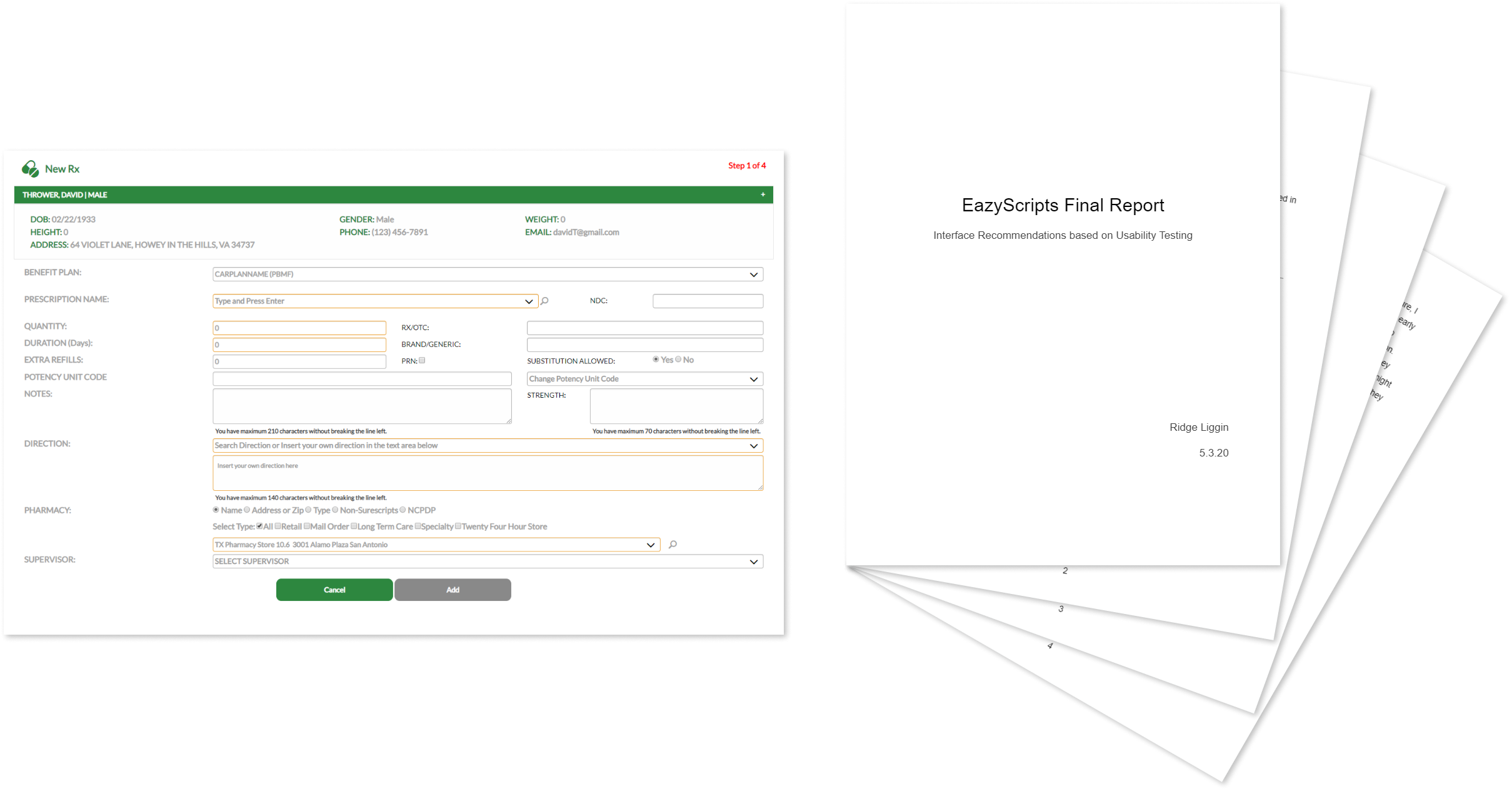
Original design of the New Rx page
Solution
3/6
In order to fully solve the usability problems within the e-prescribing workflow, I had to establish this vision statement:
The New Rx workflow will help clinicians write prescriptions confidently and efficiently by aligning with their mental models, displaying critical info at the right time, and reducing extraneous cognitive load, improving both patient safety and product value.
Why this project mattered
Prescribing is a high-stakes task where errors and delays have real consequences. A bad UI increases clinician stress, puts more work on nurses and pharmacists, and delays patient care. In healthcare, UX is a safety and quality-of-care issue that cannot be neglected.
What I proposed
Given limited dev capacity, stakeholders told me that a full redesign was not feasible. So, I proposed a comprehensive usability review, followed by a concise report of findings and recommendations the team could implement incrementally. I also included photos of a rough mockup for a visual reference. My design is research-based but would require extensive usability testing before implementation.
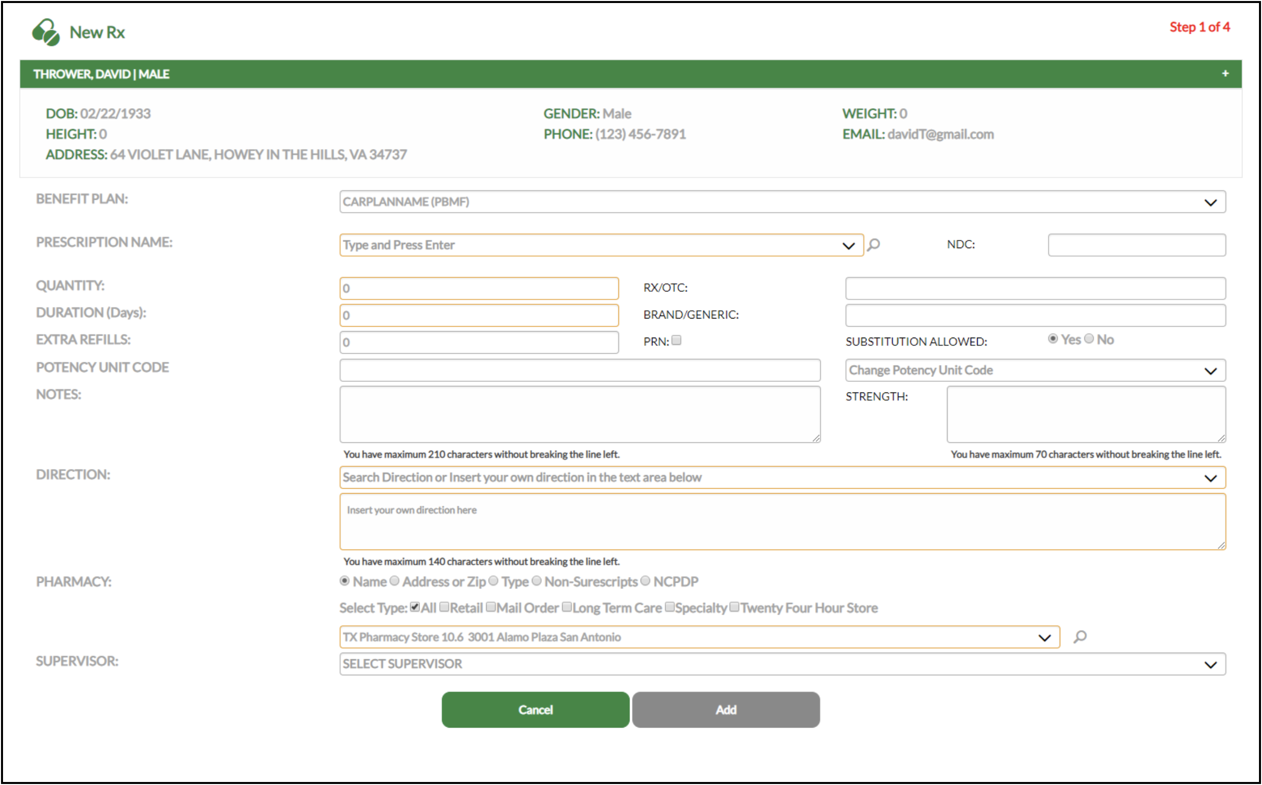
Mockup based on usability evaluation findings
Key recommendations
- Reordering inputs to match how clinicians think about dosage, duration, and quantity
- Simplifying the layout into a single-column form with stronger visual hierarchy
- Improving typography, contrast, and label placement for accessibility
- Display critical safety info, like allergies and formulary status, at decision points
- Clarifying formulary feedback before presenting alternatives
- Replace placeholder instructions with persistent labels to reduce memory load
All my recommendations were targeted, realistic, and designed to be implemented independently as dev time became available.
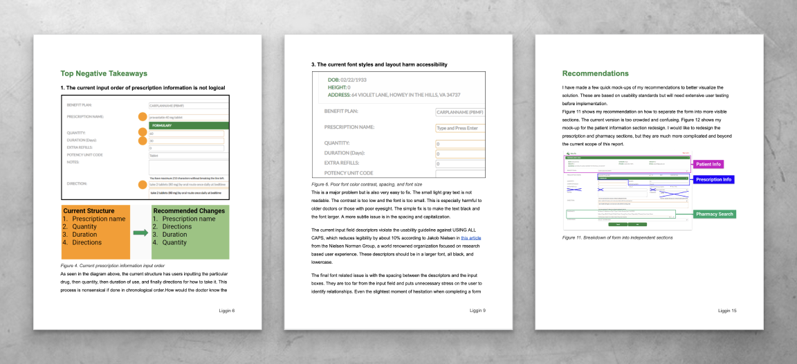
Selected pages from my report delivered to the product team
Impact
4/6
For clinicians
- Less visual clutter and better hierarchy improved scanability and trust
- A more logical input order led to faster prescribing
- Better visibility of allergies and formulary status reduced safety risks and downstream corrections
For the business and team
- A modern UI improved the product’s credibility during sales demos
- Clear report showed where UX changes would have highest impact
- The project re-framed usability as a business asset that should influence future product decisions
I presented my summarized research and design recommendations to the team and finished my internship soon after that. I was told that their product team was busy with other projects at the time, but that my work would be used for future redesign endeavors.
I believe that I helped the team understand the benefit of UX design and how small changes could significantly reduce workflow friction. I’m happy that I could leave the company with actionable documentation they could implement on their own timeline.
How this project shaped my future design work
This internship taught me the tradeoffs between thorough documentation and direct stakeholder engagement. I produced a comprehensive usability report with actionable recommendations, but in hindsight, I didn’t do enough interviews with clinicians beyond the primary SME.
At the time, I relied too heavily on heuristics and documentation to compensate for limited access and confidence. Since then, I’ve learned to have frequent conversations with users and stakeholders as soon as possible, even when access is challenging. That mindset has helped me reduce over-documentation, uncover insights faster, and focus design effort where it creates the most real-world impact.
My Approach
5/6
I began by meeting with the founder, CTO, and dev team to understand the prescribing workflow, technical constraints, and business priorities. This step was especially important in the healthcare industry where workflows are affected by regulation, habit, and time pressure.
After the walkthrough, I mapped the physician’s prescribing process step by step. This helped identify where the UI matched their mental model and where it caused discomfort or mistakes.
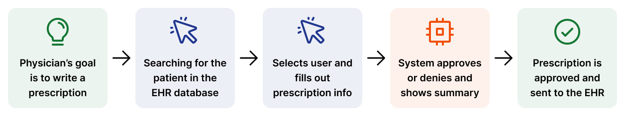
Basic example of task analysis from contextual inquiry
Usability heuristic analysis
For the UI, I conducted a heuristic evaluation of the full workflow using Jakob Nielsen’s usability heuristics. This is a famous framework that can uncover both obvious usability problems and subtle issues that slow users down or increase errors.
I also did an accessibility review focused on color contrast, font size, typography, spacing, and label usage. All this research produced a comprehensive set of usability problems.
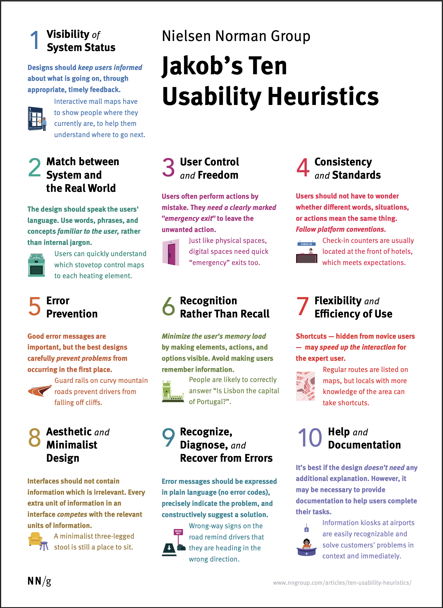
Nielsen’s 10 usability heuristics
Once I completed the research, I prioritized all problems based on severity and implementation effort. I regularly checked in with stakeholders to ensure I fully understood the problems before working on potential solutions.
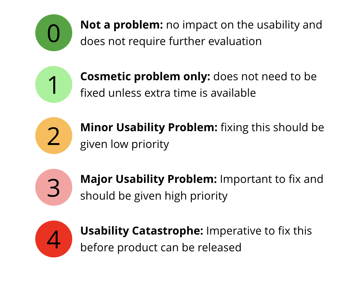
My usability problem severity scale
Final report delivery
Finally, I organized my findings into a report and began synthesizing solutions. Since a full redesign wasn’t possible at that time, I focused on simple, high-impact changes that were still doable with limited development time. This limited scope helped build trust and avoided wasting time on unfeasible changes.
Lessons Learned
6/6
1.
Clarity and prioritization are more important than exhaustive documentation
2.
Dev time and resources can completely change the scope and flexibility of design
3.
Advocate for design involvement early by framing it in terms of business value
This was my first internship while still in school. I’m proud of my report and how I learned to work within medical constraints and a professional environment. I was able to practice translating academic design heuristics into clear, practical UI recommendations. But in hindsight, I should’ve spent less time on extensive documentation and more time meeting with the SME and clients when possible. I wasn’t as confident back then and instead focused on gathering screenshots and doing extraneous research.
But following the project, I realized that clients don’t need or want every design justification like a school project. This helped me alter my approach and was the first step to getting better at cross-functional communication and business negotiation. That knowledge was invaluable in all future projects.
Next project
ClinixAI | Designing a medical scribe tool →

Review of e-prescribing software
Role
Usability research Intern
Duration
Apr - May 2020
Methods
Stakeholder interviews, heuristic evaluation, task analysis, accessibility audit
Introduction
1/6
During my summer internship at EazyScripts Technology, I evaluated and redesigned their “New Rx” page used by clinicians to write and manage prescriptions within their EHR. I met with my dad, the CEO, along with his Chief Technology Officer and dev team to fully understand the product and priorities. Then, I identified usability problems and delivered practical design recommendations based on development and business constraints.
Problem
2/6
EazyScripts’ core prescribing workflow was functional but difficult to use. The problem statement below further defines the challenges that guided this design initiative.
The New Rx page is functional with prescribing tasks, but its poor accessibility, crowded layout, and illogical flow conflict with clinicians’ mental models. These issues increase cognitive load for doctors and weaken the product’s perceived quality during sales and stakeholder evaluations.
Business implications
- A more polished UI improves credibility during sales demos and evaluations
- A more intuitive flow will improve clinician efficiency and retention
- Reducing prescribing errors lowers clinical and legal risk
Constraints
- The UI must be relatively generic to blend into the EHR interface
- Components are limited by old code and integration needs
- Changes can’t be completed until dev time is allocated to the redesign
Original design of the New Rx page
Solution
3/6
In order to fully solve the usability problems within the e-prescribing workflow, I had to establish this vision statement:
The New Rx workflow will help clinicians write prescriptions confidently and efficiently by aligning with their mental models, displaying critical info at the right time, and reducing extraneous cognitive load, improving both patient safety and product value.
Why this project mattered
Prescribing is a high-stakes task where errors and delays have real consequences. A bad UI increases clinician stress, puts more work on nurses and pharmacists, and delays patient care. In healthcare, UX is a safety and quality-of-care issue that cannot be neglected.
What I proposed
Given limited dev capacity, stakeholders told me that a full redesign was not feasible. So, I proposed a comprehensive usability review, followed by a concise report of findings and recommendations the team could implement incrementally. I also included photos of a rough mockup for a visual reference. My design is research-based but would require extensive usability testing before implementation.
Mockup based on usability evaluation findings
Key recommendations
- Reordering inputs to match how clinicians think about dosage, duration, and quantity
- Simplifying the layout into a single-column form with stronger visual hierarchy
- Improving typography, contrast, and label placement for accessibility
- Display critical safety info, like allergies and formulary status, at decision points
- Clarifying formulary feedback before presenting alternatives
- Replace placeholder instructions with persistent labels to reduce memory load
All my recommendations were targeted, realistic, and designed to be implemented independently as dev time became available.
Selected pages from my report delivered to the product team
Impact
4/6
For clinicians
- Less visual clutter and better hierarchy improved scanability and trust
- A more logical input order led to faster prescribing
- Better visibility of allergies and formulary status reduced safety risks and downstream corrections
For the business and team
- A modern UI improved the product’s credibility during sales demos
- Clear report showed where UX changes would have highest impact
- The project re-framed usability as a business asset that should influence future product decisions
I presented my summarized research and design recommendations to the team and finished my internship soon after that. I was told that their product team was busy with other projects at the time, but that my work would be used for future redesign endeavors.
I believe that I helped the team understand the benefit of UX design and how small changes could significantly reduce workflow friction. I’m happy that I could leave the company with actionable documentation they could implement on their own timeline.
How this project shaped my future design work
This internship taught me the tradeoffs between thorough documentation and direct stakeholder engagement. I produced a comprehensive usability report with actionable recommendations, but in hindsight, I didn’t do enough interviews with clinicians beyond the primary SME.
At the time, I relied too heavily on heuristics and documentation to compensate for limited access and confidence. Since then, I’ve learned to have frequent conversations with users and stakeholders as soon as possible, even when access is challenging. That mindset has helped me reduce over-documentation, uncover insights faster, and focus design effort where it creates the most real-world impact.
My Approach
5/6
I began by meeting with the founder, CTO, and dev team to understand the prescribing workflow, technical constraints, and business priorities. This step was especially important in the healthcare industry where workflows are affected by regulation, habit, and time pressure.
After the walkthrough, I mapped the physician’s prescribing process step by step. This helped identify where the UI matched their mental model and where it caused discomfort or mistakes.
Basic example of task analysis from contextual inquiry
Usability heuristic analysis
For the UI, I conducted a heuristic evaluation of the full workflow using Jakob Nielsen’s usability heuristics. This is a famous framework that can uncover both obvious usability problems and subtle issues that slow users down or increase errors.
I also did an accessibility review focused on color contrast, font size, typography, spacing, and label usage. All this research produced a comprehensive set of usability problems.
Nielsen’s 10 usability heuristics
Once I completed the research, I prioritized all problems based on severity and implementation effort. I regularly checked in with stakeholders to ensure I fully understood the problems before working on potential solutions.
My usability problem severity scale
Final report delivery
Finally, I organized my findings into a report and began synthesizing solutions. Since a full redesign wasn’t possible at that time, I focused on simple, high-impact changes that were still doable with limited development time. This limited scope helped build trust and avoided wasting time on unfeasible changes.
Lessons Learned
6/6
1.
Clarity and prioritization are more important than exhaustive documentation
2.
Dev time and resources can completely change the scope and flexibility of design
3.
Advocate for design involvement early by framing it in terms of business value
This was my first internship while still in school. I’m proud of my report and how I learned to work within medical constraints and a professional environment. I was able to practice translating academic design heuristics into clear, practical UI recommendations. But in hindsight, I should’ve spent less time on extensive documentation and more time meeting with the SME and clients when possible. I wasn’t as confident back then and instead focused on gathering screenshots and doing extraneous research.
But following the project, I realized that clients don’t need or want every design justification like a school project. This helped me alter my approach and was the first step to getting better at cross-functional communication and business negotiation. That knowledge was invaluable in all future projects.
Next project
ClinixAI | Designing a medical scribe tool →